Asynchronous Slack
Summary - Slack is a very powerful communication platform, which grabs our attention too often in its default setting. Your Slack should be an environment that serves you, not overwhelms you. Changing notifications settings and the overall appearance of the UI can have a significant impact on productivity.
Start by reading this case study to have less but more meaningful interruptions. Or simply see the step-by-step guide below.
An Explorative Case Study at a Berlin Based InsurTech Startup
"Making the Trivial Seem Urgent" marks the first example in an article by the Center for Humane Technology about how persuasive technology shapes our behavior. Even though the article focuses on the compulsive behavior seen with social media, many of the aspects promoting this behavior also apply to collaboration platforms like Slack.
Constant interruptions is not necessarily a new thing. A study from 2003 found that with emails, workers from a 500-employee office equipment retailer in the UK let themselves be interrupted by new emails every 5 minutes and more importantly responded right away with an average response time of 6 seconds. With Slack is no different. I recommend looking at the shattering findings from researchers at RescueTime. According to their study the average knowledge workers checks their communication tools every 6 minutes on average with 35.5% of the users checking their emails and messages every 3 minutes or less.
The researchers also found that people who use Slack switched more often than those who used other tools. The median of the maximum consecutive minutes of focused work was around 40 minutes with 17% of people can’t even get 15 minutes of focus time.
Study Objective
I conducted a case study at Afilio, a Berlin based insurtech startup specializing in personal estate and retirement planning. With a work-from-anywhere policy, Afilio relies heavily on Slack for daily operations. Despite Slack's benefits, employees reported distractions from constant notifications and a cluttered digital workspace.
I explored these issues by modifying Slack to create a less distracting and more asynchronous communication environment. Asynchronous communication refers to every type of communication that does not happen in real time and where responses do not need to occur immediately. Asynchronous communication gives the recipient of the message flexibility in when they can respond, increasing their time for focused work and reducing distraction.
Most of the communication in Afilio's Slack channels is not time sensitive and can therefore happen asynchronously.
The study involved implementing a variant of the Slack user interface where changes were made to notification settings and the interface, contrasting it with the usual work environment over a two-week period. I sought to understand how these changes would affect employees' perceptions and productivity by sampling their experience with the work environment on a daily basis followed by an semi-structured interview at the end of the period.
The study investigated two research questions:
- Is an asynchronous workplace beneficial for activating deep work and reducing stress?
- What do employees consider the important aspects of such an environment?
Like in other startups such as Afilio, Slack is the most important source of written communication and the first source of information for every major topic in the company. Employees use Slack all day every day to exchange messages to colleagues or workgroups, bits of data, images, links to further information or to plan their lunch or coffee meeting with each other. Most employees also have direct calls with their colleagues via Slack.
Reduction of Notifications
Optimizing Slack for productivity includes drastically reducing and pausing notifications to minimize interruptions. This allowed employees to focus better by reducing the frequency of attention shifts due to real-time alerts.
 Muting the church bell of Notre Dame de Paris, styled as an 1800s drawing - DALL·E 3
The general strategy was to reduce the overall amount of distraction, but make the remaining notifications more meaningful. This led to higher quality information seeping through to the participants. Now they got notified when a message was for them instead of just about a topic they were involved.
Mute sounds
The first step involved reducing Slack notifications, beginning with muting all sounds. Typically, Slack emits an audible signal for mentions in channels, threads, or messages from coworkers and many of the integrations. For instance, at Afilio, most workers link their calendars to Slack, which alters their status and sends audible reminders before meetings. In the study, participants were instructed to mute all such notification sounds, including those for direct messages and Huddle invitations.
Pause notifications
Additionally, all desktop push-notifications were paused using Slack's "Do not disturb" mode. Although channels still showed new message indicators, no pop-up notifications appeared. We set this mode to mute notifications completely rather than for a fixed period. To ensure availability in emergencies, we enabled a feature that allows critical messages to bypass this setting once per day using self-disappearing banners for essential communications.
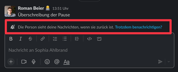 Slack allowed to bypass the notification pause once per day to reach a person in case of emergency
Make alerts more meaningful
To make the remaining notifications inside of Slack more meaningful, participants configured their first names as personal keyword notifications. This change displayed a badge next to channels with new messages mentioning their names, rather than just highlighting the channel. Furthermore, they disabled the round app badge that shows the number of notifications in the operating system's taskbar or dock.
Reduction of Visual Stimuli
Mute colors
In addition to reducing notifications, I minimized visual stimuli or from Slack's user interface. I created a new color scheme for both dark and light modes, using a light off-white and a greyish off-black for the navigation bar, respectively, with less attention grabbing light blue notification badges instead of red. The online-status indicator's color was changed to obscure each user's status visibility, to study its impact on participant communication behavior. This new color scheme was easily integrated into personal Slack settings by copying the provided hex-codes.
Declutter the Navigation
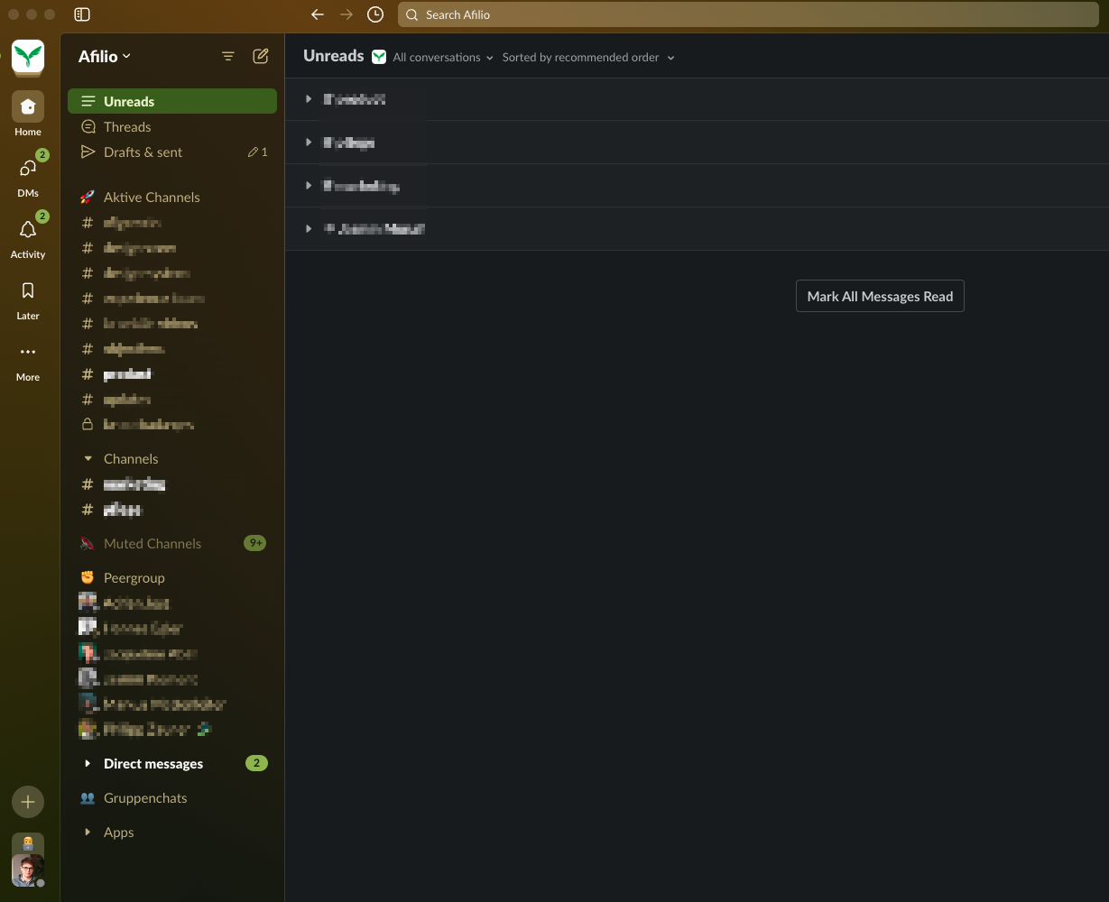
I instructed participants to declutter their Slack navigation bar by dropping irrelevant channels and dividing the remaining channels into 'relevant' and 'less relevant' sections. This division also applied to direct messages, which were segmented into "Peer Group" and "Direct Messages. By displaying only channels with unread messages in the 'less relevant' section, we significantly reduced the visual stimuli and reduced the length of the navigation bar from potentially over 200% of the viewport height to just 60-80%. Participants were also advised to adjust their settings to mark channels as read-only after viewing all new entries, ensuring that no information was missed. This approach minimized distractions while still allowing access to the information they needed through the search function.
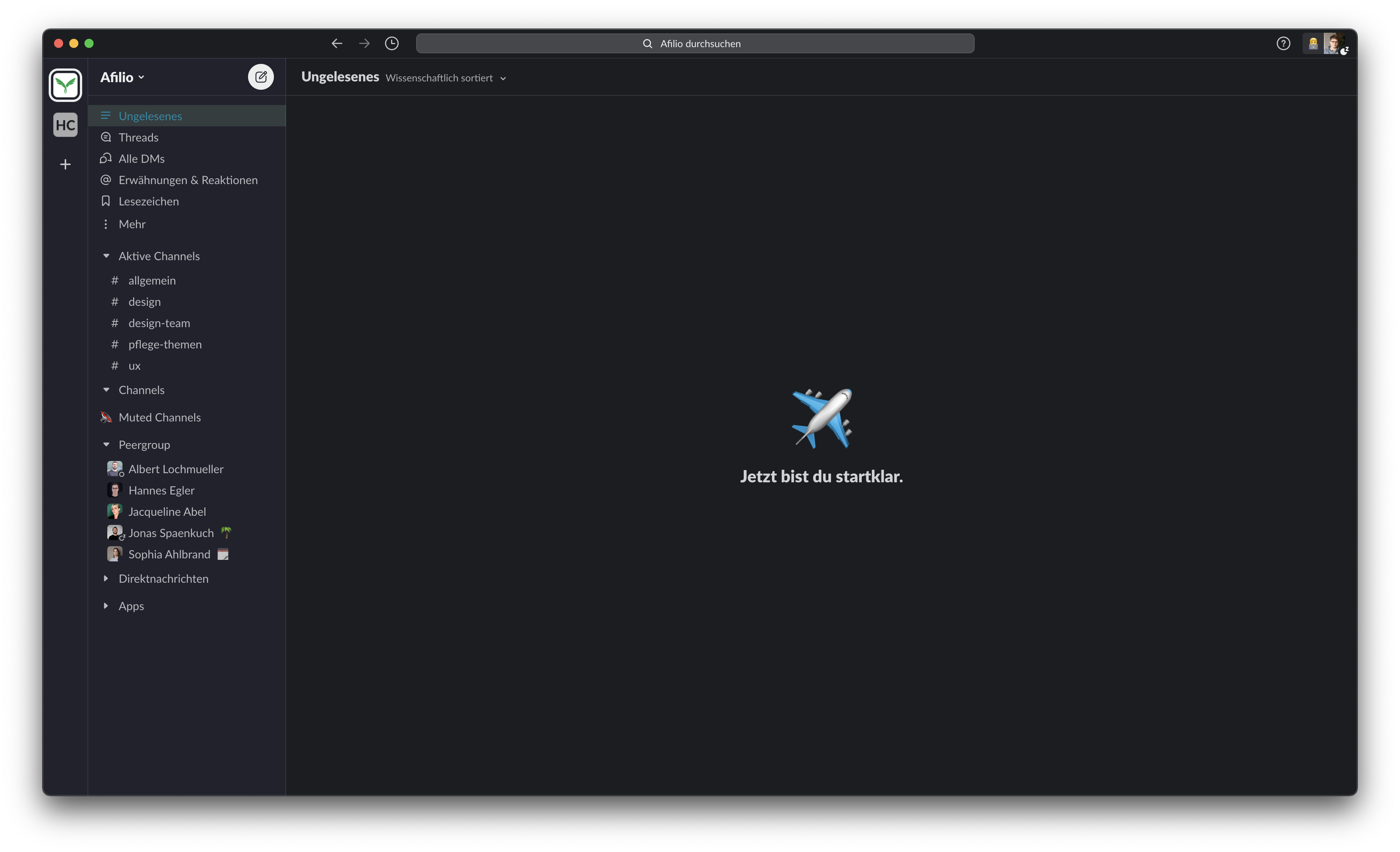 Decluttered Slack using less attention grabbing muted colors
Reduction of Direct Synchronous Communication
Employees were encouraged to schedule blocks of meeting-free time, enhancing their ability to engage in deep work without the interruption of direct synchronous communications.
I asked participants to allocate up to 3 hours of meeting-free time each day, which was meant to increase the productivity and time workers could spend focusing on more complex and more demanding tasks, such as coding, writing or designing.
Participants were told that ideally the focus time should be on the same part of each day, to create some sort of routine. After gathering best practices in terms of blocked focus time from other employees, I recommended to schedule 3 hours of consecutive focus time either before noon or 3 hours in the afternoon. This was only a recommendation and participants could also freely allocate the time over the day.
Participants communicated their focus time by setting a blocker in their company calendar. To inform the remaining Afilio employees about the fact that some of their coworkers were using an optimized version of their digital work environment, all participants adopted a personal status which stated, that they were using the “Optimized Slack”.
Outcomes and Feedback
All participants appreciated the quieter, more streamlined communication environment. They reported increased concentration and a more organized workflow, which reduced the anxiety associated with missing out on important communications. 3 of the 8 participants made their own thoughtful adjustments to Slack before the study. These settings mostly involved the degree to which they received notifications.
Reducing notifications was crucial for all study participants, particularly the elimination of desktop notifications and app badges, which were major distractions. While most participants disabled the app notification badge post-experiment, one software developer chose to reactivate it, finding it unobtrusive due to his self-hiding macOS dock. Participants generally found app badges disruptive as they often prompted unnecessary checks for non-urgent updates. The reduction in desktop notifications significantly decreased distractions, contributing to enhanced focus and inner calm. However, the removal of notifications led to missed communications, especially Huddle requests, revealing a flaw in the notification pause feature. Despite this issue, the experiment highlighted the importance of a reliable mechanisms to ensure critical communications are not missed. Participants appreciated the keyword notification feature, which highlighted channels containing their names, improving the visibility of relevant messages.
Before the experiment, Afilio's Slack workspace displayed all channels and messages without distinction, which overwhelmed users. Simplifying this by categorizing channels into 'relevant' and 'less relevant' sections significantly reduced visual clutter and the fear of missing out, as participants quickly adapted to the streamlined navigation. While some initially feared missing important information, they soon learned that minor oversights were not critical. The cofounder noted the constant update of information on Slack could be overwhelming but acknowledged the importance of access to information balanced with individual discipline. Excessive browsing of Slack, often to follow conversations across multiple threads, was noted to distract participants and reinforce unproductive habits. However, reducing visible items in the navigation bar helped focus interactions and reduce unnecessary information. Changes to the color scheme, particularly the use of less attention grabbing colors like light blue and green instead of red, were also well received for reducing alertness and visual strain. Participants appreciated these adjustments, leading to a more focused and less intrusive use of Slack.
Conclusion
The experiment at Afilio demonstrated significant benefits from optimizing Slack to reduce distractions and promote asynchronous communication. By implementing these adjustments, teams can enhance their productivity and focus, ultimately fostering a more balanced and efficient work environment. For any team looking to improve their use of digital communication tools, consider these insights and recommendations as a guide to fostering a more productive and less disruptive workspace.
However, the project showed the importance of company-wide adoption and clear communication policies to support these changes effectively.
In conclusion, embracing asynchronous communication and optimizing digital tools like Slack not only supports individual productivity but also enhances overall team dynamics. It's about creating an environment where technology serves us, not overwhelms us, allowing for a more focused and less stressful workflow.
Step-by-step Guide
5. Recommendations for Slack Optimization
To leverage Slack more effectively for asynchronous work, consider implementing the following strategies:
Notification Management: Customize your notification settings to reduce interruptions. Consider using the 'Do Not Disturb' feature during focus times and turning off non-essential alerts.
Channel Organization: Regularly review and organize Slack channels and conversations. Prioritize channels that are most relevant to your work and mute or leave those that are not.
Scheduled Focus Times: Block out times on your calendar for uninterrupted work. Communicate these boundaries clearly to your team to minimize disruptions.
Use of Statuses: Utilize Slack statuses to inform your team when you are in deep focus work or available for communication. This helps set expectations for response times.
Cultural Shifts: Encourage a culture where asynchronous communication is the norm rather than the exception. This involves training and consistent practice across the team to adjust communication habits.
Slack Settings
Go to Slack Preferences and find the submenu on the left
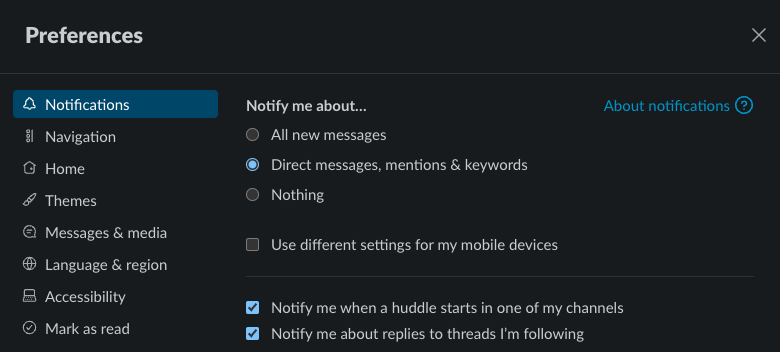
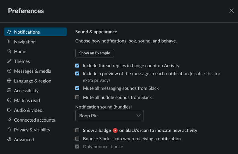
Notifications
Choose whatever you prefer at the 'Notify me about…' settings. The notification schedule has much bigger impact on reducing distraction.
I've chosen to get notified about 'Direct messages, mentions & keywords'. I also choose to be notified when a huddle starts in one of my channels and to be notified about replies to my threads.
Keywords
In general, I try to have less but more meaningful interruptions. Personal keywords help with that. As with notifications in general, less is more. Keep things simple
I have Roman, UX set as personal keywords.
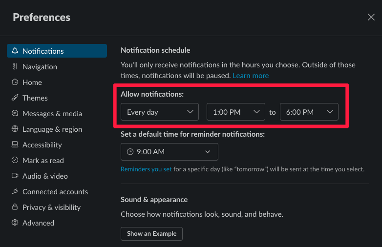
Notification schedule
Start by scheduling notifications (e.g. for PM only) or reduce them more rigorous. Curiosity will make you check Slack from time to time anyway, so less is more.
Sound & appearance
Mute all sounds except for huddles ans disable the red badge on the Slack icon
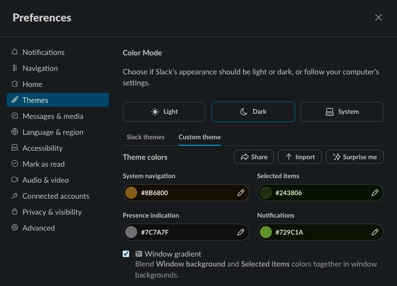
Color Theme
I recommend to avoid signal colors such as shades of red and yellow. These colors are naturally perceived as brighter and quickly grab our attention. Color is often used in data visualization as an pre-attentive feature.
Pre-attentive processing happens, when we perceive / sense something without giving it attention:
 Pre-attentive color processing: The woman in the red shirt is likely to be notices first
For Slack I tried to use green as a main color for notifications but feel free to choose whatever you like besides red.
Slack Navbar
Choose whatever you prefer in the Slack settings. The real adjustment comes from decluttering your vertical navbar inside the Slack UI.
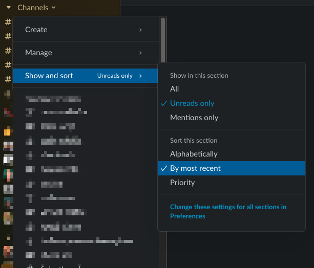
Group Channels
I recommend dividing the channels into "Active channels" (in which you are frequently active) and "Channels" (in which you are less active). Channels can be moved using drag & drop. Only unread channels are displayed under the less relevant "Channels" section.
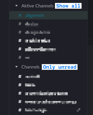
Show and sort
Each channel group can have individual visibility settings. I've chosen to show only channels with unread messages for the channels that I'm less active in. I sort these channels by most recent.
DMs and Group Chats
The same division principle applies to DMs with your peers and other individuals in your organization as well as group chats. So i created three section for DMs
- Peer group
- Direct messages
- Group chats
I found that group chats often arise in slightly different constellation. Organizing them in a collapsed group frees the navigation from unnecessary information. This also makes it very easy to close old conversations as they are sorted from new to old conversations.
Example
Reduce the side navigation by displaying only unread channels and DMs. I also try to keep less relevant sections collapsed.
Final Words
Not all of these modifications are suitable for everyone and some have a bigger impact than others. If I had to break it down to the two most significant changes I would recommend everyone to:
- Start to schedule notifications or to turn off desktop push-notifications completely
- Change the color theme of the UI to a more assuring green hue rather than an alerting red (this is the most easy thing to do to take away distraction from Slack.)