Accessible Buttons for Senior Users
Summary - At Afilio, we created a set of accessible and understandable buttons that can clearly communicate their role and state based on redundant visual cues such as color, appearance and movement.
Together with my design colleagues at Afilio, I created buttons for our predominantly senior (60+) user base. The goal was to clearly differentiate the buttons from each other and from other interactive elements, and to make the buttons more accessible. Each button should also clearly communicate its role and state to the user through multiple visual cues.
Designing Button Interaction Principles for a 60+ User Base
We started the design process by simultaneously working on button design principles and the different roles a button could take.
- Which button roles do we need?
- How do we visually communicate the differences?
We simply were not able to identify a clear starting point and started working on button roles and appearance in parallel, converging towards one solution to the two problems, before we start going round in circles. Always keeping these two aspects in mind.
Identify Button Roles
Thinking about it now, the definition of clear roles is probably the more important aspect. Also because the visual appearance can be changed more easily than the button's inherent role or the underlying hierarchy between the buttons.
Have a clear role or purpose for each button. Don't start designing without at least loosing a though on possible roles. And keep in mind that some roles may having best practices attached to them. Such as 'only have one primary action on a page'. Otherwise the user may not be able to clearly point out the next action.
The idea behind roles is that the designer can use buttons effectively to communicate a hierarchy between all affordances offered by the UI.
We identified five different roles for our labeled button set:
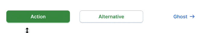
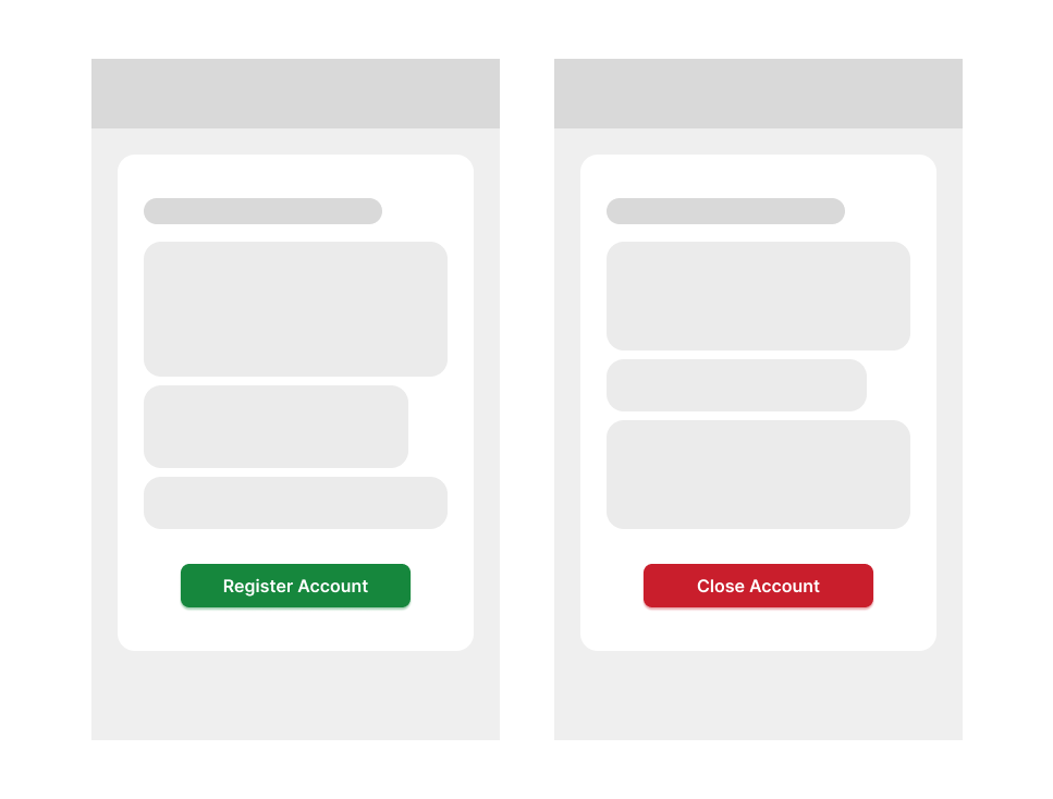
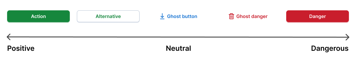
Primary Action Button
We use the primary action button for CTAs and the most important actions.
Best practice: Don’t have more than one primary action on one page. If everything seems important, users can’t distinguish between unimportant and important actions. One primary action can have multiple primary buttons on a page.
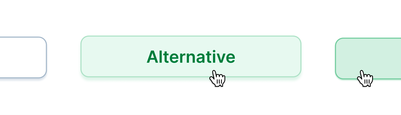
Secondary Alternative Button
For less pronounced 'alternative' actions, we use the secondary alternative button. It can also be used as the negative alternative when paired with a positive primary button.
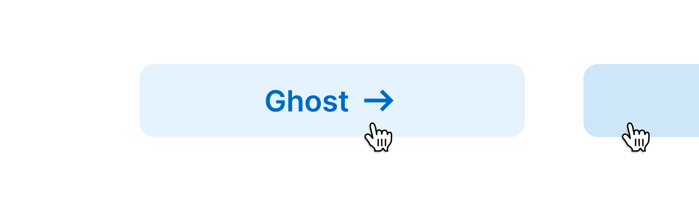
Ghost Button
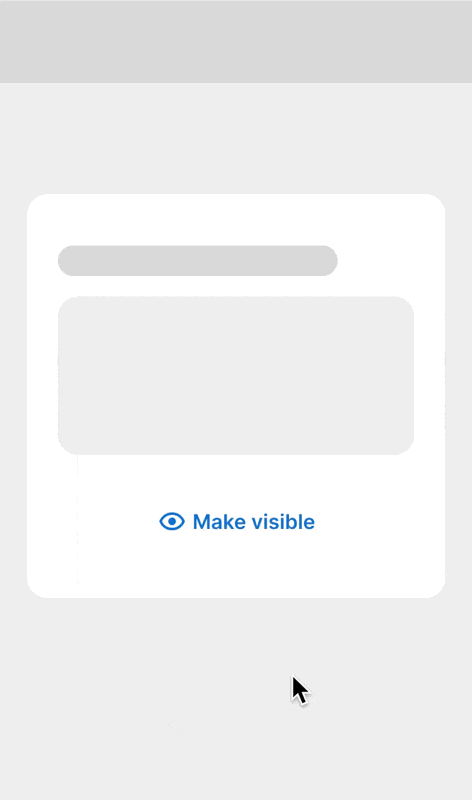
The ghost button marks the least pronounced action and other functionality within the app. It can also be used as the negative action to an existing positive action.
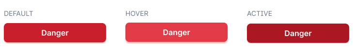
Danger Button
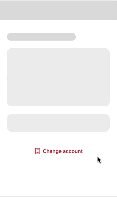
The danger button is reserved for destructive, irreversible actions, such as closing an account.
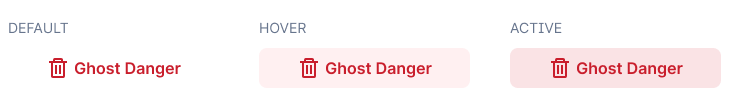
Ghost Danger Button
The ghost danger button is used for reversible destructive actions like canceling a subscription. Also for actions that lead to destructive actions, such as the button leading to closing an account.
Identify Button Types
We designed easy to distinguish button types in order to have a clear visual hierarchy. The goal was to have a design which allows distinguishing between types without the use of color.
The idea behind types is that the user can easily distinguish between more and less important or grave actions.
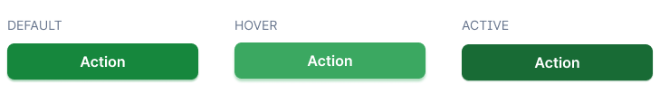
Primary Button Type
The primary button type has the most visual weight and represents the most important or grave action Such as register (primary button) or closing (danger button) an account.
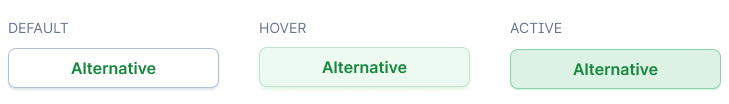
Alternative Button Type
The alternative button has less weight and finds itself in the hierarchy under the primary button. Alternative buttons do not have a fill color such as primary buttons but unlike the ghost button they have a stroke revealing their dimensions.
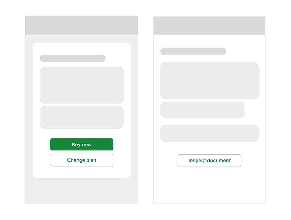
Alternative buttons work in conjunction with primary buttons or on their own.
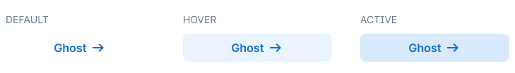
Ghost Button Type
The body of ghost buttons are hidden, like ghosts, and only become visible on mouseover or when clicked. Ghost buttons have almost no weight, also like ghosts, and are the lowest ranking labeled buttons. Only underbid by icon-only buttons.
The ghost button is also the only button to cast no shadow. Which makes sense in the world of ghosts. More on shadows in the design principles below.
Icon-Only Button Type
Icon only button don't have a label and communicate their function only via the icon. They look and behave like alternative buttons without the label but due to their size and missing text have much less weight in the button hierarchy.
Icon-only buttons should only be used when their action can be derived from the surrounding context.
Button Design Principles
Multiple Visual Cues
To communicate the differences between buttons, we used a range of visual cues. To increase usability, it was important to us to not simply rely on one visual cue but to always have multiple cues active to communicate a buttons role, importance and state.
Role Signifier
To communicate the role of a button we primarily used color and body contrast as the main distinguishing characteristics.
- Color
- Contrast
- Also: size / weight
Color was mainly used to communicate the role of a button. For example, green communicates a positive and favourable action while red indicates a dangerous or irreversible one. Blue ghost buttons find themselves between the two poles, representing neutral actions.
Contrast and appearance of the button's body was used as a mean to communicate effect size. With primary buttons signalling the strongest effect and ghosts having the least pronounced effect.
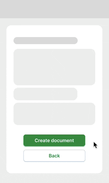
For example a primary action might log you in, or finishes a process such as creating a document, while an alternative takes you one step back and a ghost lets you simply inspect some information.
Giving the button an infill also makes it seem heavier and more important. Removing the infill and the stroke leaves us with a smaller appearing and lightweight ghost button.
Button State Feedback
We wanted to eliminate uncertainty due to lack of system feedback by having the buttons clearly communicate their state and whether they have received the user's input. Even without actively seeing the cursor, the user can validate their actions through button states.
To further increase usability and system-side feedback we let every button have four states:
- Default state
- Hover state (on mouseover)
- Active state (on click)
- Disabled
To communicate state changes, we stayed with our design principle to rely on multiple visual cues to communicate a button's state. On interaction with a button (mouseover / click), the button would change all of it's four visual characteristics stated below:
- Color change
- Movement along the z-axis
- Shadow
- Visbility (ghost button only)
We wanted to give the primary and alternative buttons a sense of spatiality so we visually raised them from the background by giving them a dropshadow:
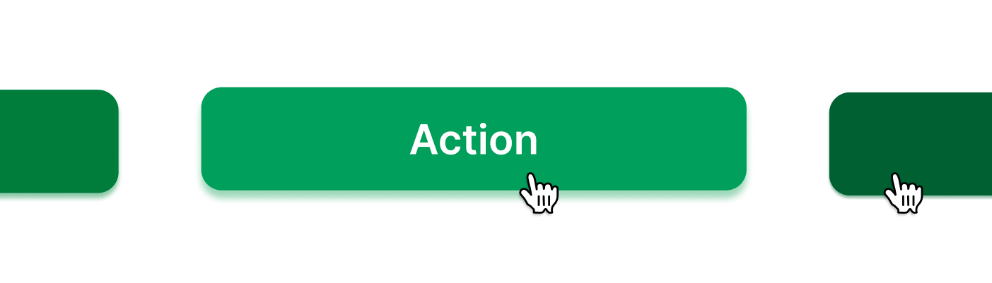 Left default state, middle hover state, right active state
In hover state, the button would bright and move up towards the user, to communicate it's readiness and confirm it's functionality. The same principles apply for when the button is pressed, just in the other direction. On press the button becomes darker and moves away from the user as if the applied force moves the button. We used this skeumorphism to resemble the use of buttons which the user might know, such as the ones from a remote control.
The button would reflect it's light on the imaginary surface below it, so when the button brightens up or changes it's color like with the alternative button, the shadow also changes color
The ghost button on the other hand has no spatiality but it's body becomes visible on interaction. It also has no stroke and without a "real" body it casts no shadow.
Accessibility
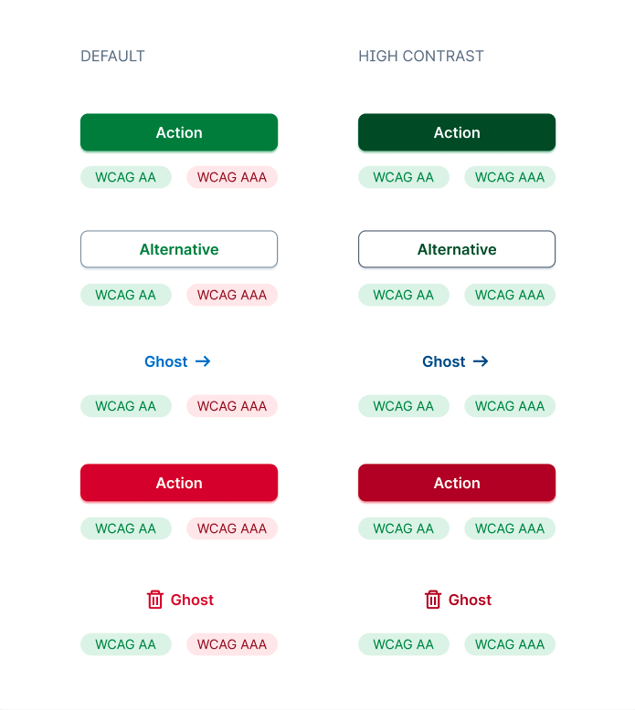
Contrast
We made sure that our three main colors green, blue and red were at least WCAG AA compliant. To reach AA compliance, the text must at least have a contrast ratio of 4.5:1.
High Contrast Mode
Our design system allowed to quickly design and implement a high contrast mode for our buttons and other components of the user interface. The high-contrast mode aims to reach WCAG AAA compliance. For AAA text must have a contrast ratio of at least 7:1.
Font Size
The minimum font size used in the buttons is 16pt, which ensures that the labels can be read by most users.
Button Shape
Because we use pills / badges as depicted above in our UI, we wanted buttons to be less round and more rectangular. In our initial design we chose 4px border radius whcih we later chaged to 8px (depicted throughout this article).
Neuroimaging research suggest, that rounder shapes are generally more positively perceived as edgy ones. Additionally round shapes can reduce cognitive strain, thus making it easier for user to interact with.